ROLE/SERVICES
Branding
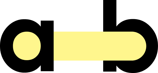
BRAND
Abralin
LOCATION & YEAR
Curitiba, Brazil 2023
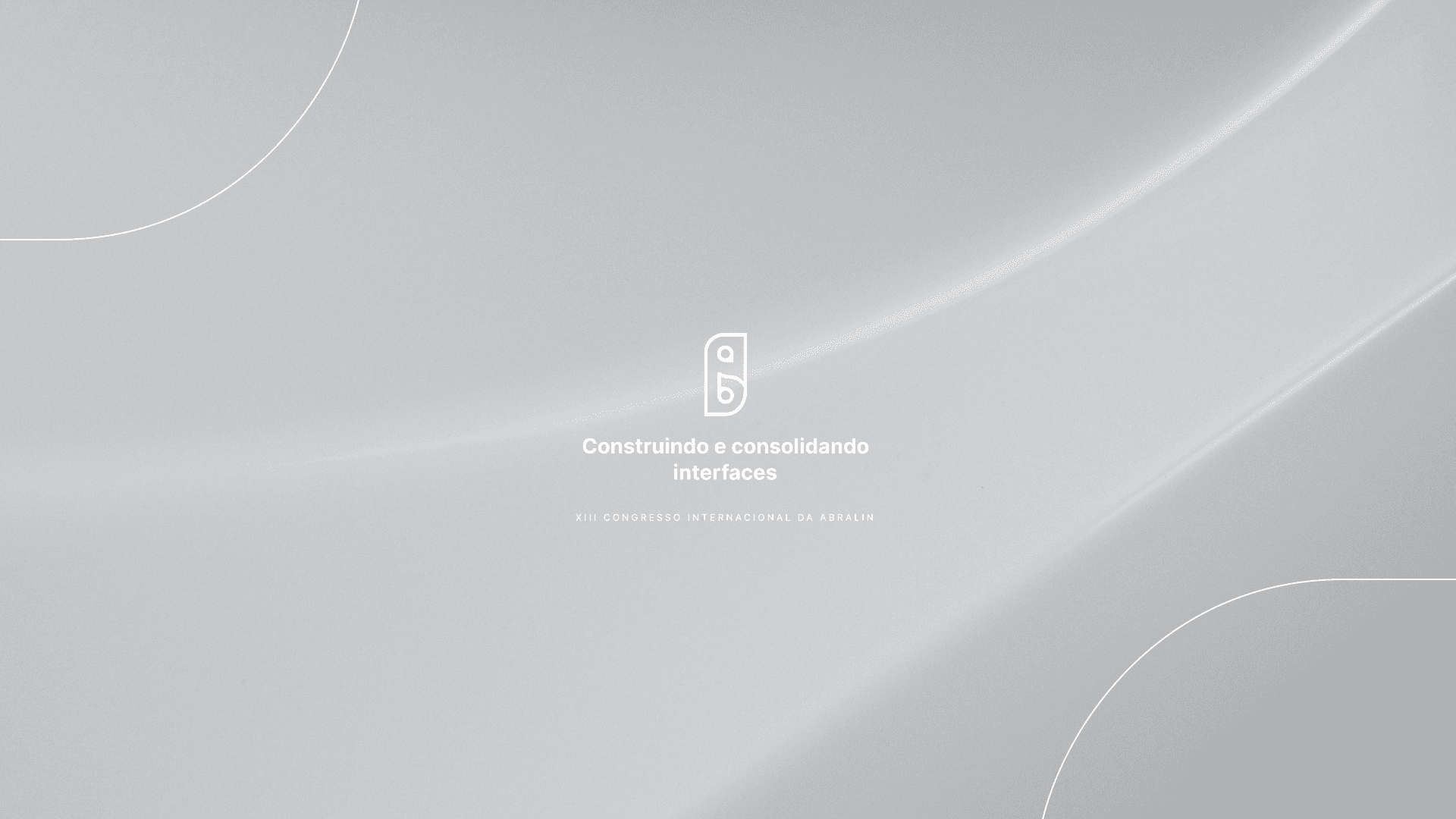
The project

DRAWING CONSTRUCTION
The design of the logo for the event "Building and Consolidating Interfaces" was based on the event's promoter, Abralin.
With a branding that strongly relies on the initials of the abbreviation of its name, the design incorporated the initials through lines and curves that complement the visual identity already present in the Abralin brand.
The curved and symmetrical lines interact with the visual identity already present in the Abralin brand and provide a compact look to the logo.

The initials of the name Abralin are an important feature of the logo, considering the visual reinforcement in relation to the main brand.


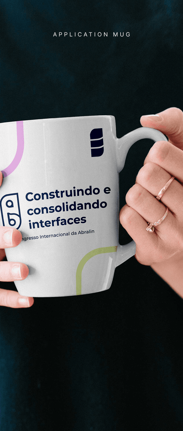
EVENT LANDING PAGE APPLICATION

SIMPLIFICATION OF SYMBOL
In order to ensure the legibility of the symbol in any graphic material, a simplification of the original logo was developed, incorporating more minimalist elements while still sharing the same essence.

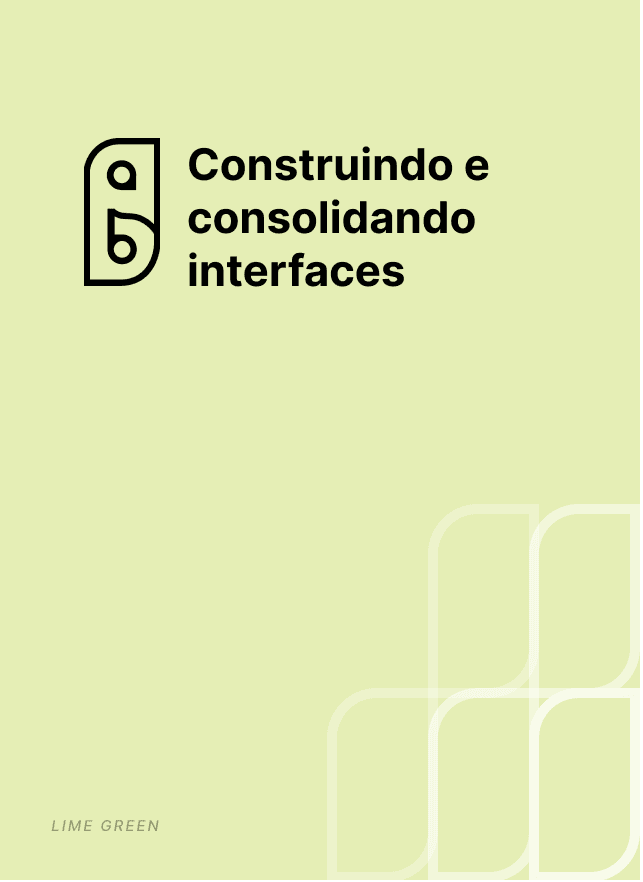
CONSTRUCTION OF THE SIMPLIFICATION
The shape of the simplification was maintained from the original logo to preserve the brand concept and allow for a visual association.
The curved lines were associated with the branches of the araucarias, trees that are a symbol of Paraná (the event's host state).


Abralin
By Lucas Matsumura

Next Project